Menus and Toolbar Options to work with Output Back
to Previous
When working with output, TrueStandings Servicing
provides a series of menu tabs that provide access to the features and
options in that category. These menu options are as follows:
Note: Based on the application you are working
in, some options may not be enabled.
· Home
· Tools
· Data
· Grid
· Graph
· Format
Opening Toolbar Ribbons and Drop Down Menus Back
to Previous
These tabbed menu options enable/disable the toolbar
ribbons and also provide a drop down menu with options found on the toolbars.
The toolbar ribbons display an icon button for the options available from
a menu selection. The drop down menu provides access to all options associated
with a menu selection. The menubar processes as follows to display the
toolbar ribbons and drop down menus:

|
Ribbon/menu
selector tabs |
When
you click the menu name (e.g., Home), the toolbar ribbon is updated
to reflect the options available from that menu. There is a series
of five menus (Grid menu toggles to Graph when displaying the
output in either grid or graph view). |

|
Toolbar
ribbon |
This
ribbon will display the toolbar icon buttons for the options available
from the selected menu. |

|
Drop
down menu |
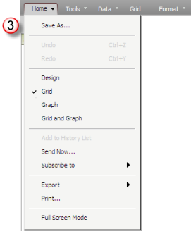
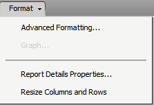
When
you click the down arrow  next
to a menu name, the drop down menu is presented as shown below. next
to a menu name, the drop down menu is presented as shown below. |
Ribbon toolbar opened for the Home menu:

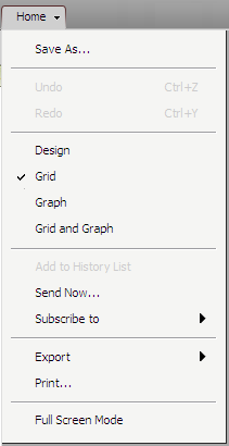
Drop down menu opened for the Home menu:

Drop
Down Menu |
Ribbon Icon |
Options: |
Action |

|

|
Save As... |
Presents the Save dialog |

|
Undo |
Undoes the last action |

|
Redo |
Redoes the last undone action |

|
Design |
Switches your view to Design
Mode |

|
Grid |
Switches the data display to
Grid view |

|
Graph |
Switches the data display to
Graph view |

|
Grid and Graph |
Switches the data display to
Grid and Graph view |

|
Add to History List |
Adds the current report to your
History List |

|
Send Now... |
Presents the Send Now dialog
to email data |

|
Subscribe to |
Provides access to add a subscription |
 
|
Export |
Provides access to export the
data to a formatted file or to PDF |

|
Print |
Opens the Print dialog to specify
print options |

|
Full Screen Mode |
Updates view to full screen (ESC
key exists full screen mode) |
Note: The Tools icon ribbon
bar includes the Home options for Save, Undo, Redo, Design Mode, Grid
View, Graph View, and the Grid and Graph View in addition to the options
specific to the Tools menu.
Drop
Down Menu |
Ribbon Icon |
Options: |
Action |

|

|
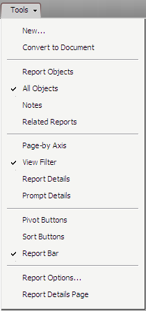
New... |
Opens the Create Report page
to create a new report |

|
Convert to Document |
Converts the current report to
a document |

|
Report Objects |
Opens the Report Editor panel
with Report Objects tab displayed |

|
All Objects |
Opens the Report Editor panel
with All Objects tab displayed |

|
Notes |
Opens the Report Editor panel
with Notes tab displayed |

|
Related Reports |
Opens the Report Editor panel
with the Related Reports tab displayed |

|
Page-by Axis |
Opens the Page By panel |

|
View Filter |
Opens the View Filter panel |

|
Report Details |
Opens the Report Details panel |

|
Prompt Details |
Opens the Prompt Details panel |

|
Pivot Buttons |
Toggles the display of the Pivot
Buttons on the grid |

|
Sort Buttons |
Toggles the display of the Sort
Buttons on the grid |
(No Icon) |
Report Bar |
Toggles the display of the Report
Bar on the grid |

|
Report Options |
Opens the Report Options dialog
to work with the setup for grid |
(No Icon) |
Report Details Page |
Opens the Report Details page |
Note: The Data icon ribbon
bar includes the Home options for Save, Undo, Redo, Design Mode, Grid
View, Graph View, and the Grid and Graph View in addition to the options
specific to the Data menu.
Drop
Down Menu |
Ribbon Icon |
Options: |
Action |

|

|
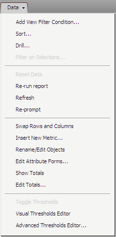
Add View Filter |
Opens the View Filter panel to
define a new view filter condition |

|
Sort... |
Opens the Advanced Sort dialog |

|
Drill... |
Opens the Advanced Drill dialog |

|
Filter on Selections... |
Reruns the current report with
the current selections added as report filter conditions |
(No Icon) |
Reset Data |
Resets the current output dataset |

|
Re-run Report |
Re-runs the report and creates
a new entry in your History List |
(No Icon) |
Refresh |
Refreshes the data for the current
report |

|
Re-prompt |
If report is prompted, redisplays
the prompt page to modify the report request |

|
Swap Rows and Columns |
Switches the current template
setup for rows and columns |

|
Insert New Metric... |
Opens the Insert New Metric dialog
to define a new metric for the report |

|
Rename/Edit Objects |
Opens the Rename/Edit Objects
dialog to rename any of the data elements on the report |
 
|
Edit Attribute Forms... |
Opens the Attribute Forms dialog
to modify the forms used on the report and allows you to toggle
the forms you have selected (toggle option is not on menu) |

|
Show Totals |
Toggles the report to display
and hide totals |

|
Edit Totals |
Opens the Edit Totals dialog
to allow you to specify the totals to be included on the report |

|
Toggle Thresholds |
When thresholds are defined,
will toggle the view to show/hide thresholds |

|
Visual Threshold Editor |
Opens the Thresholds Editor panel
to define or edit a threshold |

|
Advanced Thresholds Editor |
Opens the Advanced Thresholds
Editor dialog to define or edit a threshold |
Note:
The Grid icon ribbon bar includes the Home options for
Save, Undo, Design Mode, Redo, Grid View, Graph View, and the Grid and
Graph View in addition to the options specific to the Grid menu.
Drop
Down Menu |
Ribbon Icon |
Options: |
Action |
The Grid option does not include
a drop down menu, it only provides
a toolbar ribbon with icons |

|
Template |
Defines the formatting template
for the grid - this provides a drop down list of predefined grid
layout templates that automatically format elements of the grid
|

|
Banding |
Enables/disables banding for
the grid |
|

|
Outline |
Enables/disables outlining of
data for the grid |
|

|
Merge Column Headers |
Enables/disables merging column
values into one cell on the grid (e.g., combines duplicated values
in consecutive header cells into one cell) |
|

|
Merge Row Headers |
Enables/disables merging row
values into one cell on the grid (e.g., combines duplicated values
in consecutive row cells into one cell) |
|

|
Lock Row Headers |
Locks the row headers on the
grid as you scroll from left to right |
|

|
Lock Column Headers |
Locks the column headers on the
grid as you scroll from top to bottom |
|

|
Auto Fit to Contents |
Automatically size the column
width on the grid to fit the contents of each column |
|

|
Auto Fit to Window |
Automatically size the column
width on the grid to fit the window area |
Note:
The Graph icon ribbon bar includes the Home options
for Save, Undo, Design Mode, Redo, Grid View, Graph View, and the Grid
and Graph View in addition to the options specific to the Graph menu.
Drop
Down Menu |
Ribbon Icon |
Options: |
Action |
The Graph option does not include
a drop down menu, it only provides
a toolbar ribbon with icons |

|
Graph Type |
Drop down list of the graph types
available for selection |

|
Graph Subtype |
Drop down list of graph subtypes
available based on the selected Type |
|

|
Legend |
Enables/disables the legend from
display on the grid |
|

|
Values |
Enables/disables the display
of values on the graph bars/plot lines |
|

|
Series by Row |
Defines the graphed series based
on the rows in the grid (columns are then used for the categories) |
|

|
Series by Column |
Defines the graphed series based
on the columns in the grid (rows are then used for the categories) |
|

|
Auto Arrange |
This option will auto arrange
the layout of the graph. This option is to be used when the contents
in the graph overlap. This corrects the overlapping.
Note: The Auto Arrange icon
is not enabled if your graph was saved with Automatic graph layout
enabled. If your graph report was saved with Automatic layout
enabled, you do not need to automatically reposition the contents
of your graph in Web. |
|

|
Categories (Count) |
Count of categories displayed
on the view graph at one time (this creates a scrolling set of
views for the plotted data)
Note: Once this or the Series value
is changed, you must click the Apply button to update your view
of the graph |
|

|
Series (Count) |
Count of series displayed on
the view of the graph at one time (this creates a scrolling set
of views for the plotted data)
Note: Once this or the Series value
is changed, you must click the Apply button to update your view
of the graph |
|

|
Apply |
Updates the view of the graph
once you modify the count of categories or series to display on
the view of the graph |
Note: The Format
icon ribbon bar includes the Home options for Save, Undo, Design Mode,
Redo, Grid View, Graph View, and the Grid and Graph View in addition to
the options specific to the Format menu.
|
Icon/Field |
|
Description |

|

|
Grid/Graph Element |
This drop down list allows you to
select the grid/graph element being formatted.
When viewing a grid, the drop down list
includes options for All Cells, Row Axis, Column Axis, All Metrics
and as well as each attribute and metric included on the grid.
When viewing a graph, the drop down
list includes options for Format (graphed elements), Titles, Axes,
Series Colors.
You select the grid/graph element to
be formatted and this then controls the options on the Grid Element
Characteristics drop down. |
|

|
Grid/Graph Element Characteristic |
Once you have selected the grid/graph
element to be formatted, you must specify the characteristic of
the element.
When viewing a grid, this drop down
list allows you to select either All, Values or Header. When All
is selected, the cell values AND the row or column header is reformatted.
When viewing a graph, this drop down
list varies dependent on the selected Graph Element. |
|

|
Font Setting |
The font settings allow you to specify
the font to use and the size of the font. |
|

|
Font Formats |
The font format settings allow you
to specify if the font is presented as bold, italic and/or underlined.
These settings are independent of one another and each are applied
to the specified grid/graph element and characteristic being formatted. |
|

|
Text Alignment |
This formatting option is only applied
to elements on a grid and are not enabled for any graph elements.
The alignment settings allow you to
specify left, centered or right justification of the text within
the cell. This is a format setting group and only one option is
applied to the selected grid element and characteristic. |
|

|
Numeric Formats |
This formatting option is only applied
to elements on a grid and are not enabled for any graph elements.
The numeric format settings allow you
to specify the type of number being presented. The numeric values
may be defined as either currency or percentage. This is a format
group and only one option is applied to the selected grid element
and characteristic. When selecting the currency format option,
the format assumes two decimal places while the percent format
option assumes no decimals. The selected grid element and characteristic
must be a numeric value to apply this formatting. |
|

|
Numeric Comma Separator |
This formatting option is only applied
to elements on a grid and are not enabled for any graph elements.
The comma separator is applied to numeric
values and adds a comma every third place from right to left after
the decimal (if a decimal is present in the formatting). The selected
grid element and characteristic must be a numeric value to apply
this formatting. |
|

|
Decimal Precision |
This formatting option is only applied
to elements on a grid and are not enabled for any graph elements.
The decimal precision options allow
you to increase or decrease the number of decimal precision displayed.
There are two options for this, one to increase and one to decrease.
These will not move the decimal but add decimal precision places
to the display (e.g., if a value calculates as 59.145 and only
one decimal place is displayed, the value is presented as 59.1;
the precision options will expand and contract what is presented
in the cell by one decimal place at a time).
The selected grid element and characteristic
must be a numeric value to apply this formatting. |
|

|
Background Color |
The background color option allows
you to define the fill color for the selected grid/graph element
and characteristic. The drop down list provides a predefined palate
of colors with access to an advanced dialog to define a custom
color. You may also enable two colors and a style for gradient
color formatting. |
|

|
Line Color |
The line color option allows you to
define the color of the border for the selected grid element and
characteristic or the line associated with the background of a
graph element. The drop down list provides a predefined palate
of colors with access to an advanced dialog to define a custom
color. |
|

|
Text Color |
The text color option allows you to
define the color of the text for the selected grid/graph element
and characteristic. The drop down list provides a predefined palate
of colors with access to an advanced dialog to define a custom
color. |
|

|
Cell Border |
This formatting option is only applied
to elements on a grid and are not enabled for any graph elements.
The cell border option allows you to
specify if the cell for the selected grid element and characteristic
includes a border and which sides of the cell have the border.
The drop down list provides selections for All, None, Top, Bottom,
Left and Right. |
|

|
Cell Border Type |
This formatting option is only applied
to elements on a grid and are not enabled for any graph elements.
The cell border type option allows you
to specify the type of border line is applied to the selected
grid element and characteristic. The drop down list provides options
for None, Dashed, Dotted, Thin, Thick or Double. |
|

|
Advanced Grid Formatting |
The advanced grid formatting option
allows you to open the Advanced Formatting dialog which provides
additional control over the formatting of the selected grid element
and characteristic. This option is only enabled when viewing the
output in a grid.
Refer to the Advanced Formatting Dialog
section for more information on the tabs and options you can define. |
|

|
Advanced Graph Formatting |
The advanced formatting option allows
you to open the Advanced Formatting dialog which provides additional
control over the formatting of the selected graph element and
characteristic. This option is only enabled when viewing the output
in a graph.
Refer to the Advanced Formatting Dialog
section for more information on the tabs and options you can define. |
![]()
![]()
![]()
![]() next
to a menu name, the drop down menu is presented as shown below.
next
to a menu name, the drop down menu is presented as shown below.
